Design and Brand Guidelines
Company Introduction:
POGO is a modern route planning platform designed to simplify navigation, trip organization, and route management through an intuitive and user-friendly digital experience.
The brand identity focuses on innovation, clarity, and accessibility while maintaining a clean and modern visual system that connects with tech-savvy users.
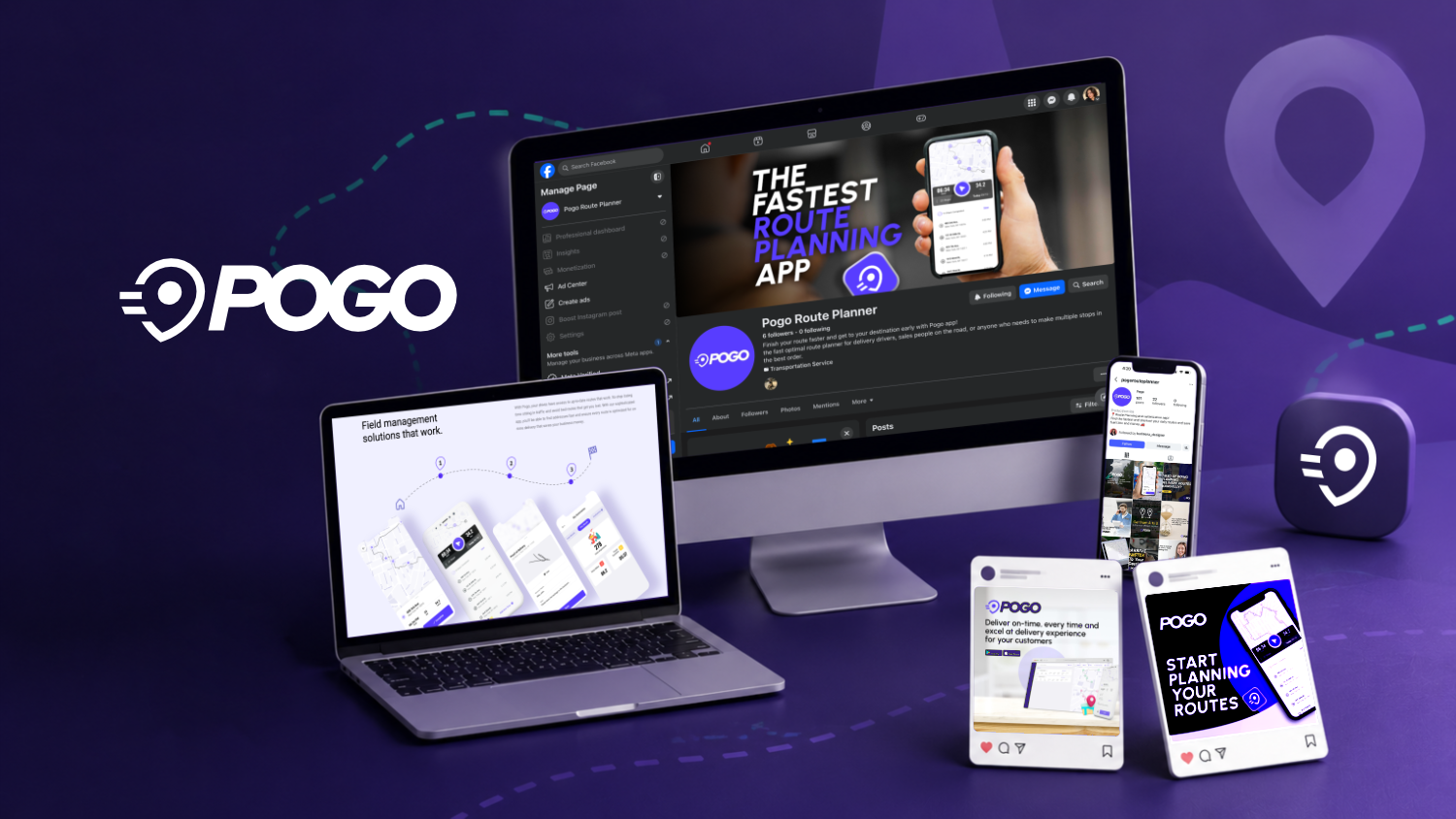
The POGO logo was designed to communicate speed, precision, and intelligent route planning through a clean and modern visual identity. The combination of the icon and typography creates a recognizable brand that reflects efficiency, movement, and technology.
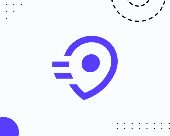
Logo Symbol
The icon is a simplified map pin, one of the most recognizable symbols for location and navigation. It represents the core purpose of POGO: helping users identify destinations and optimize their routes.
The circular element inside the pin symbolizes a destination point, while the two horizontal lines extending from the left create a sense of motion and forward movement. Together, these elements convey the idea of fast, efficient navigation and continuous progress.
The rounded geometric shapes give the icon a friendly and approachable appearance while maintaining a modern and digital aesthetic.
Logo Text
The wordmark uses a bold, sans-serif typeface to communicate confidence, reliability, and simplicity. Its thick letterforms ensure excellent readability across digital and print applications while reinforcing the brand’s strong and dependable personality.
The clean typography complements the icon without overpowering it, creating a balanced visual identity that is both memorable and versatile.
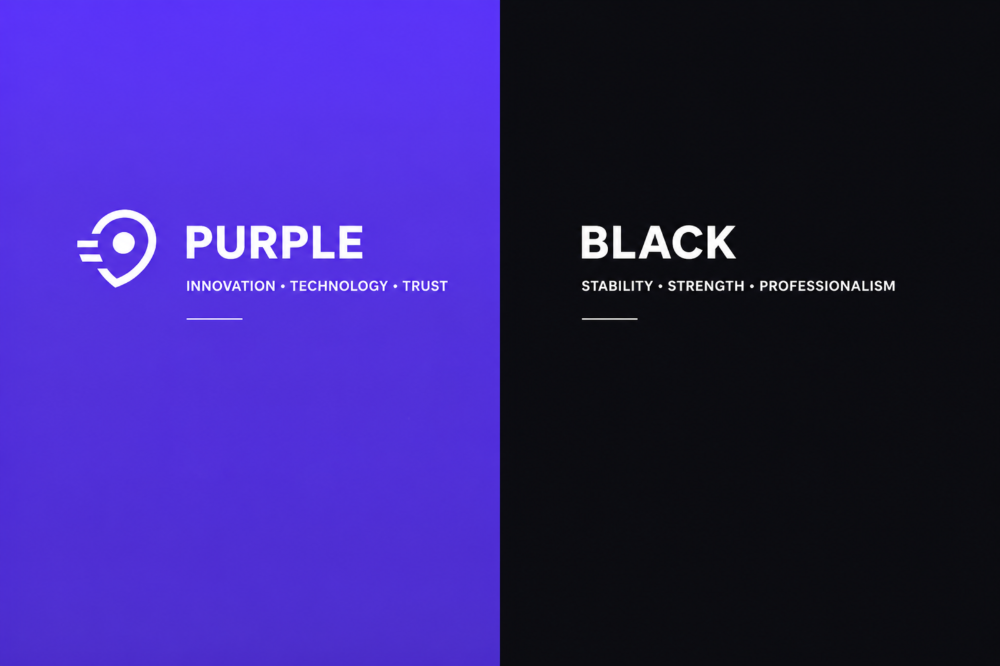
Color Meaning
The vibrant purple was chosen to represent innovation, technology, creativity, and trust. It helps position POGO as a modern digital solution while making the brand visually distinctive within the navigation and route-planning industry.
The black typography provides contrast and stability, reinforcing professionalism and ensuring high legibility in all branding materials.
Design Rationale
The POGO logo was intentionally designed with simplicity and functionality in mind. Every element supports the brand’s mission of making route planning faster, smarter, and more intuitive. The minimalist design allows the logo to remain recognizable across mobile applications, websites, maps, and marketing materials while reflecting the efficiency and reliability users expect from a route planning platform.
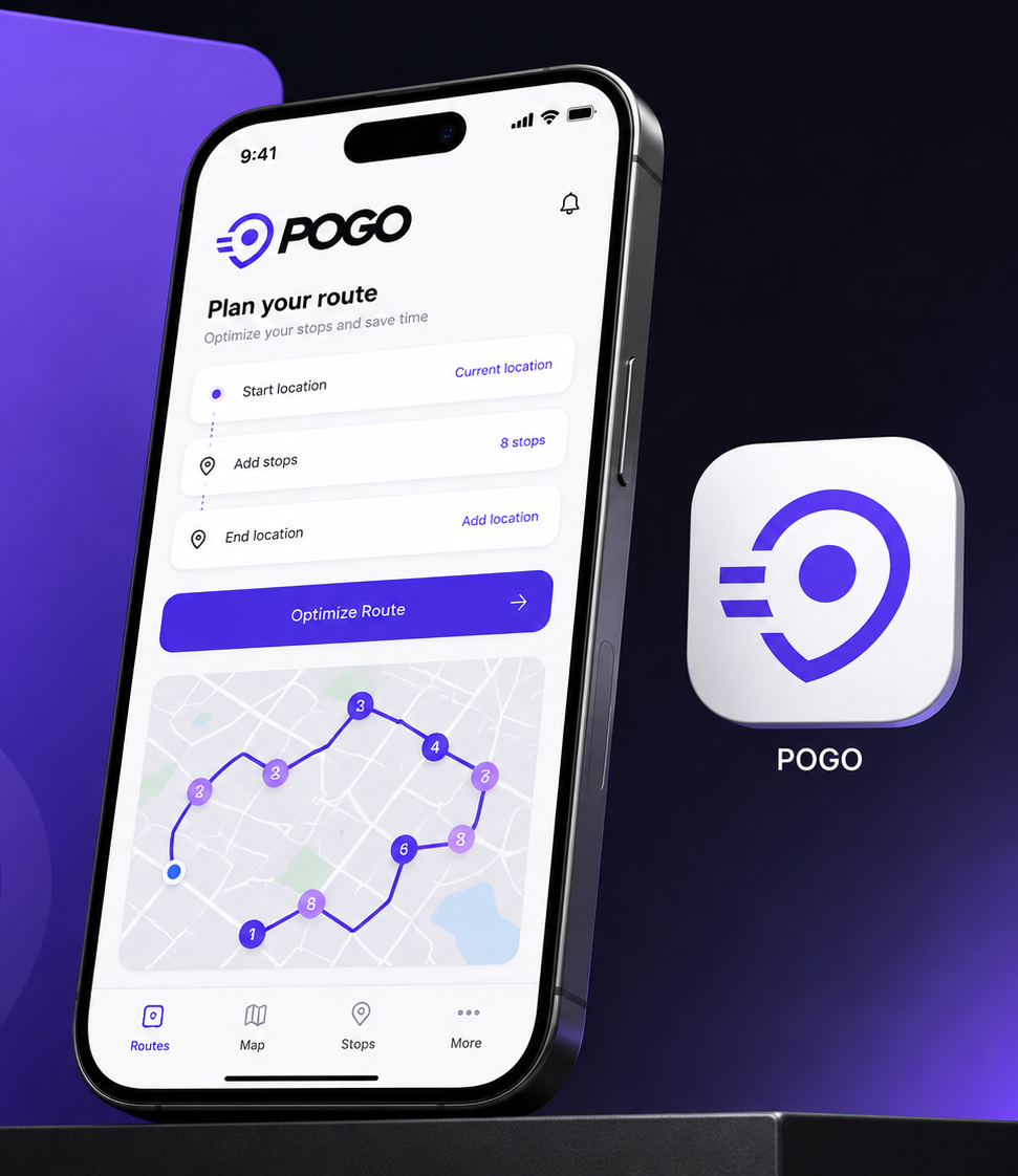
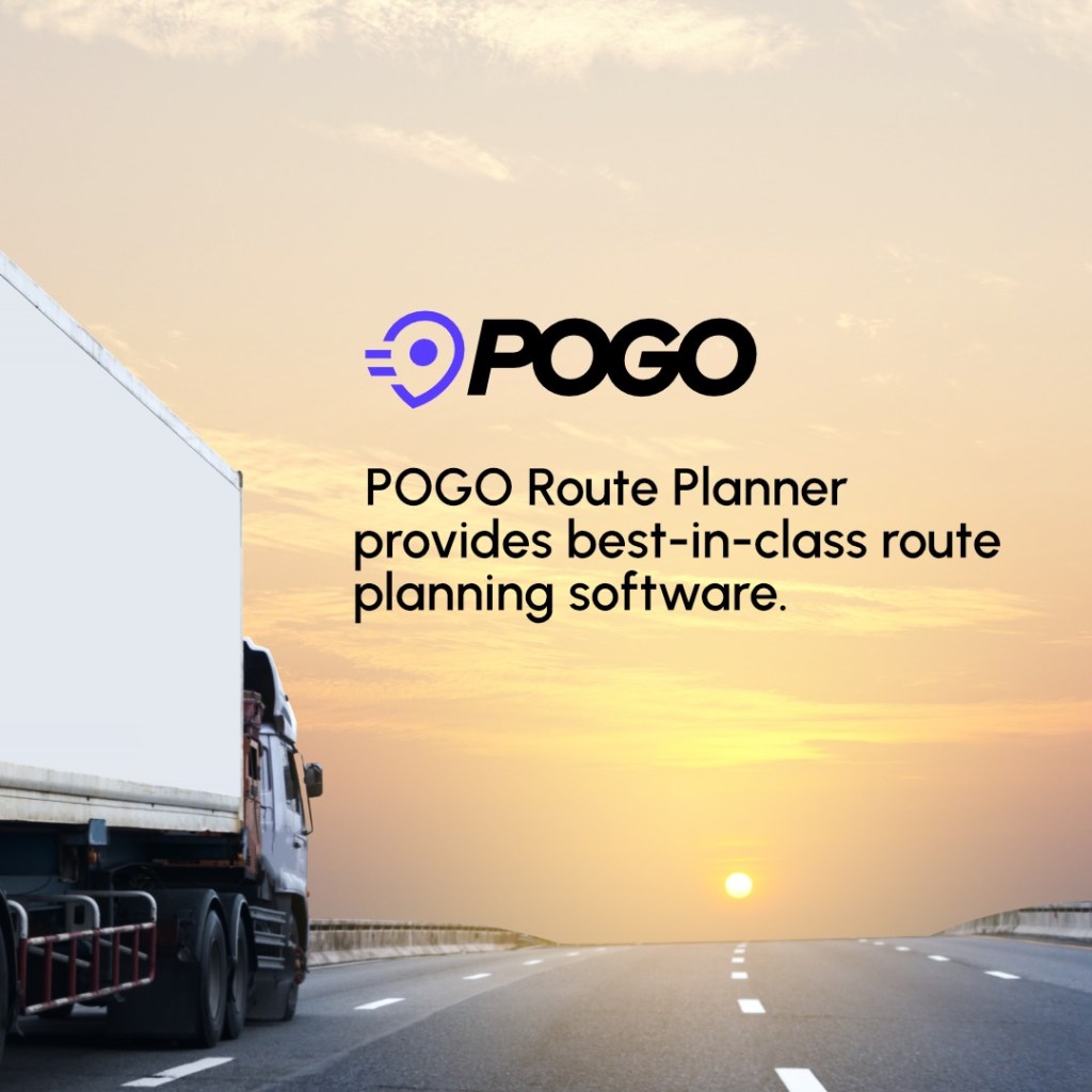
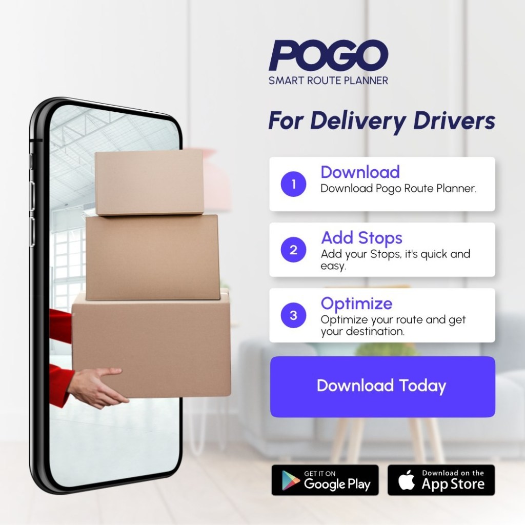
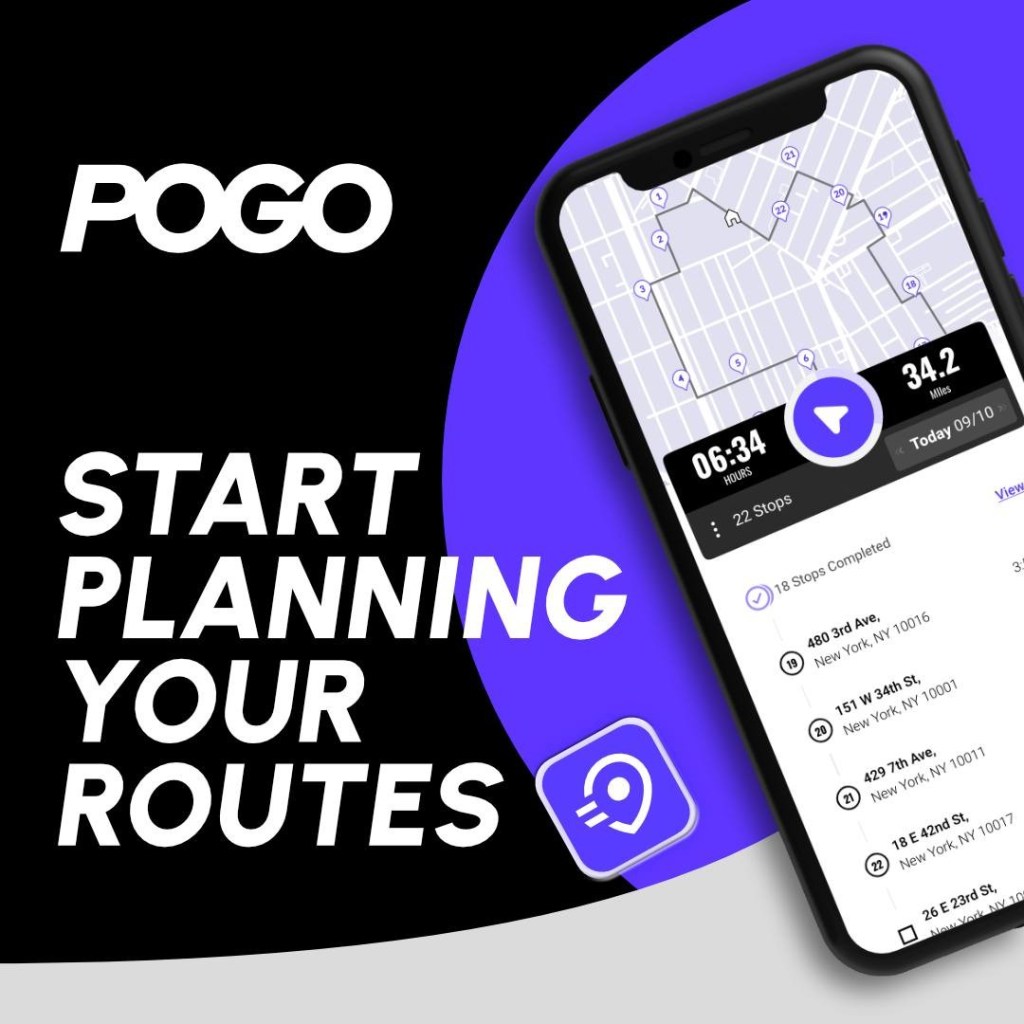
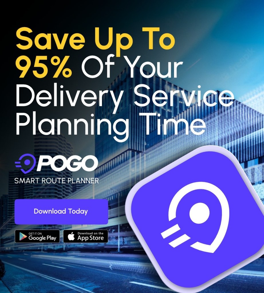
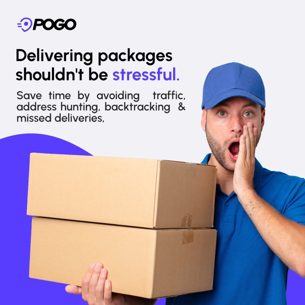
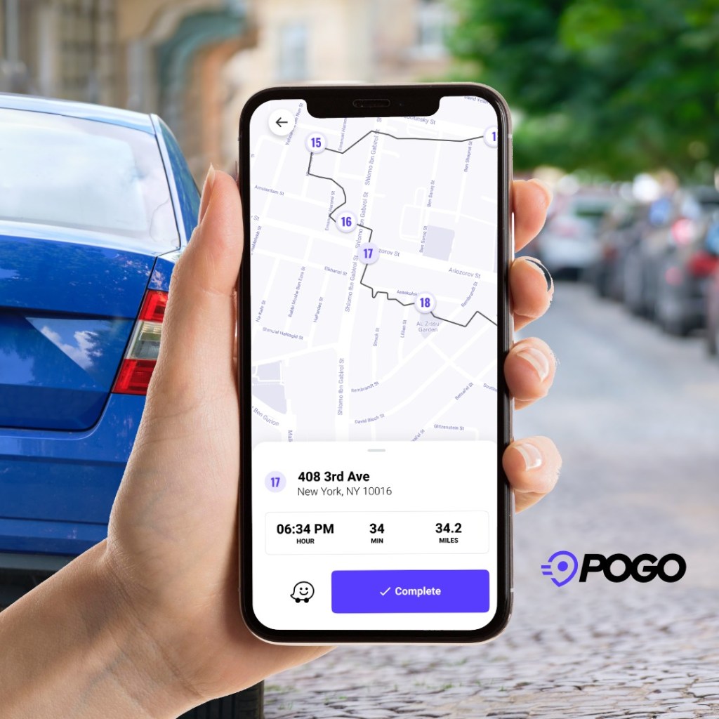
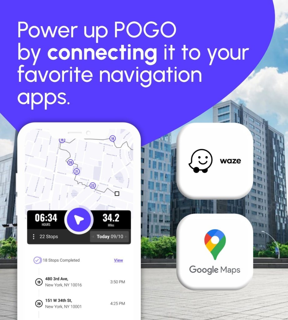
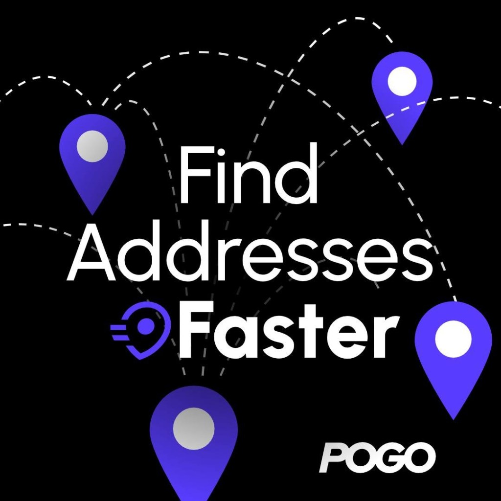
Social Media Design System for Pogo Route Planner
The design of Pogo Route Planner’s publications focuses on creating a clear, engaging, and consistent visual identity that communicates the app’s features, updates, and benefits effectively. Through strategic use of layouts, visual hierarchy, and branding elements, the designs help users understand the platform’s value while strengthening brand recognition across digital channels.
The goal is to transform route planning features and information into visually appealing content that improves user engagement and creates a cohesive experience for the community.

Landing Page Design for Pogo Route Planner
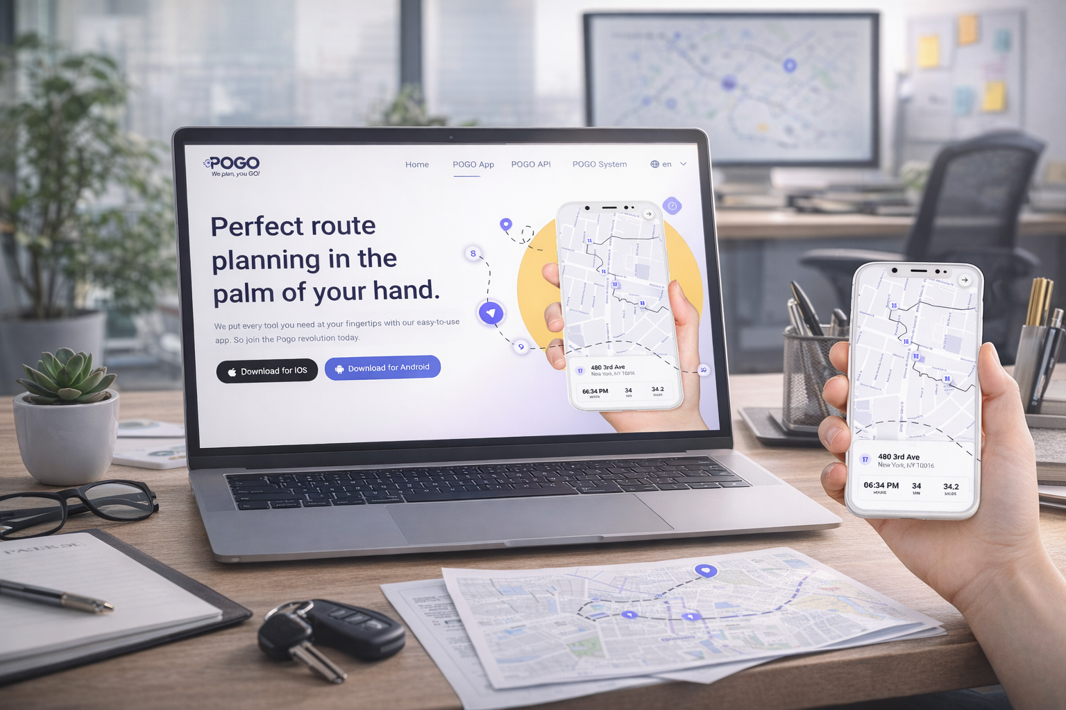
The website design for Pogo Route Planner was created to introduce the product, communicate its key features, and guide users toward downloading and using the app. The goal was to build a clear and engaging digital experience that highlights the value of efficient route planning while creating a seamless connection between the website and the mobile application.
Through strategic layout, visual hierarchy, and user-focused design decisions, the landing page helps users quickly understand the app’s functionality, improves product visibility, and encourages conversion from visitors into active users.


Enjoyed This Project?
Discover more projects or get in touch to discuss how we can create impactful digital experiences together.

FAQs
1. What services do you offer?
I offer brand design, website design, UI/UX, graphic design and social media content.
2. What’s your design process like?
Once everything is signed, we get started. I begin by getting to know your vision, goals, and audience. From there, I explore ideas, share concepts, and refine everything with your feedback until it feels just right.
3. How long does a project take?
It really depends on the project. Branding usually takes around 1–3 weeks, while websites or UI/UX projects can take a bit longer. I’ll always give you a clear timeline before we start.
4. Do you offer revisions?
Of course. Revisions are part of the process — we’ll refine things together until everything feels right and aligned with your vision.
5. How do we get started?
You can reach out through my contact form or send me a message. I’ll ask a few questions about your project and we’ll take it from there.
6. What do you need from me to start?
Just some basic info about your business, goals, and ideas. Don’t worry — I’ll guide you through everything step by step.

